Jane Austen may have died in 1817, but her novels have survived more than 200 years -- not only survived, but they've been reinterpreted in a hundred different ways, none more so than her most beloved novel, Pride and Prejudice. The story of Mr. Darcy's pride and Elizabeth Bennet's prejudice has been invaded by zombies, turned into a Gothic melodrama by P.D. James, reinvented as a millennial's video blog -- and yet the novel itself never changes. Each generation recreates Pride and Prejudice in its own image, and the results are sometimes beautiful, sometimes, well, not so beautiful, and sometimes (inadvertently) hilarious.
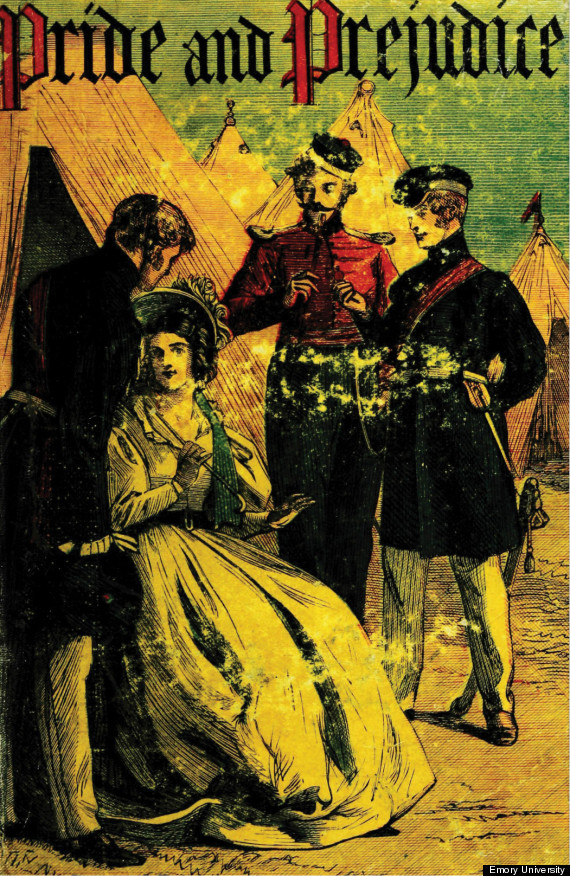
Chapman and Hall Select Library of Fiction
Image credit: Emory University
In Austen's own time, books were plainly packaged in cardboard, to be rebound by the owners in leather, but in the mid-19th century -- around the time the copyright of the novels expired -- cheap new editions appeared, sold in railway stations for busy commuters. The covers of these "yellowbacks" were illustrated to reflect the fashions of the time, though one must wonder who thought an illustration of what appears to be Lydia Bennet flirting with soldiers at Brighton would be a representative scene fromPride and Prejudice!
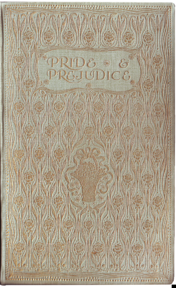
Brock Watercolor Edition
In the late 19th and early 20th century, publishers produced books that were truly representative pieces of Art Nouveau style. I have several of Austen's novels from this series, published by J.M. Dent & Co., in my own collection, and they are treasured by Austen fans not just for the beautiful gold-embossed cover or the iconic watercolor illustrations by Charles Brock, but because they are truly beautiful objects, with elaborately illustrated endpapers and title pages.
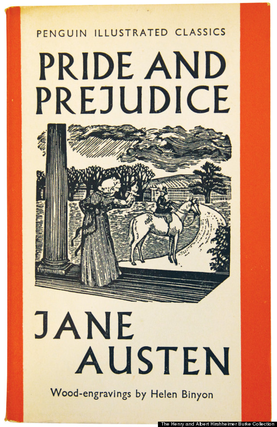
Penguin Illustrated Classics
Image credit: The Henry and Albert Hirshheimer Burke Collection and the Winn Family Collection, Goucher College Special Collections
In the mid-20th century, Austen's work, being in the public domain, was produced in many editions by many publishers, some meant for the educational market and others for general consumption.
Penguin already had tremendous success with its first paperback books when it published Pride and Prejudice as part of its Illustrated Classics line, including woodblock engravings by Helen Binyon. Cheap and easily pocketable, Penguin's paperbacks were a true revolution in publishing.
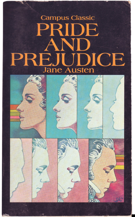
Campus Classics
Elizabeth and Darcy are dragged, kicking and screaming, into the 1970s; at least, one would imagine so. Perhaps this edition, published for Scholastic Book Services and therefore a school-age market, was meant to attract the jaded eye of the ever-inscrutable teenager, yet still be true to its roots. It succeeds, in a fashion, but is still very much a thing of its time.
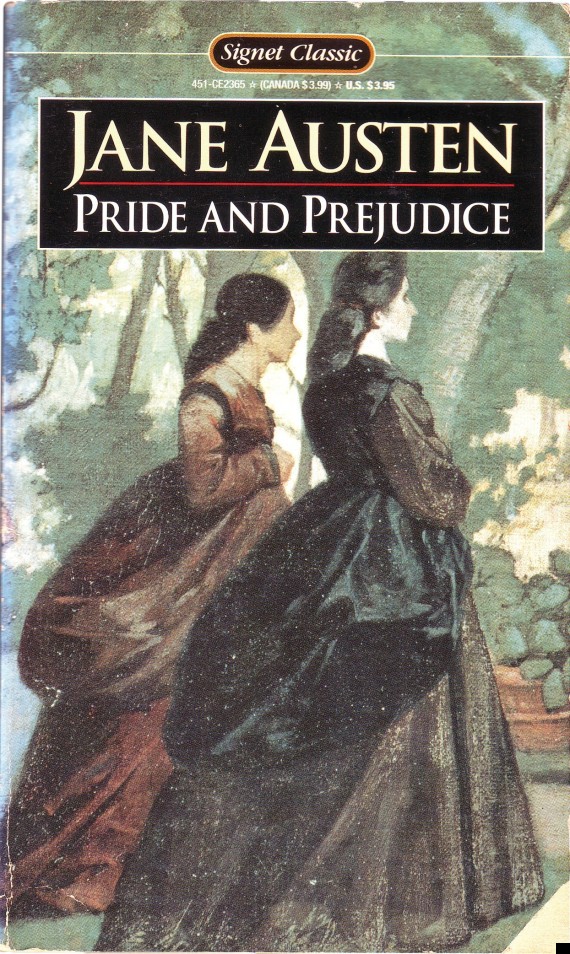
Signet Classics
Signet Classics are reliable and inexpensive paperback editions, often used in the secondary-school market and just as often read by adults who appreciate their low cost and ubiquity. It probably seemed like a good plan to choose a vaguely old-fashioned-looking painting of two women who could, perhaps, be Elizabeth and Jane Bennet...had the Bennet sisters somehow been transported forward about 40 years into a Charlotte Brontë novel. (Noooo! cry the Janeites. Not the Brontës!)
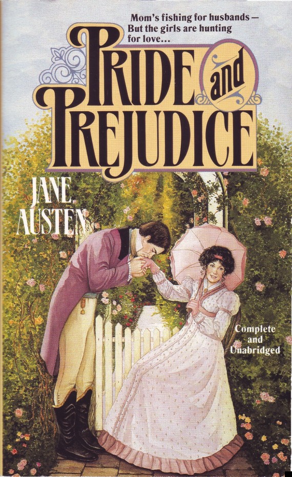
Tor Mass-Market Editions
Much to the consternation of more serious-minded Austen fans, her novels are sometimes given covers that place them squarely in the romance-novel genre, such as this 1994 edition of Pride and Prejudice, on which Mr. Darcy, splendid in a purple tailcoat, bestows a kiss on Elizabeth's hand, and perhaps then bursts into a chorus of "Purple Rain."
Fortunately, in the 21st century things are improving on the Jane Austen cover-design front -- for the most part. There are still a few head-scratchers about, but some book designers are doing great work that Austen fans consider worthy of their favorite author.
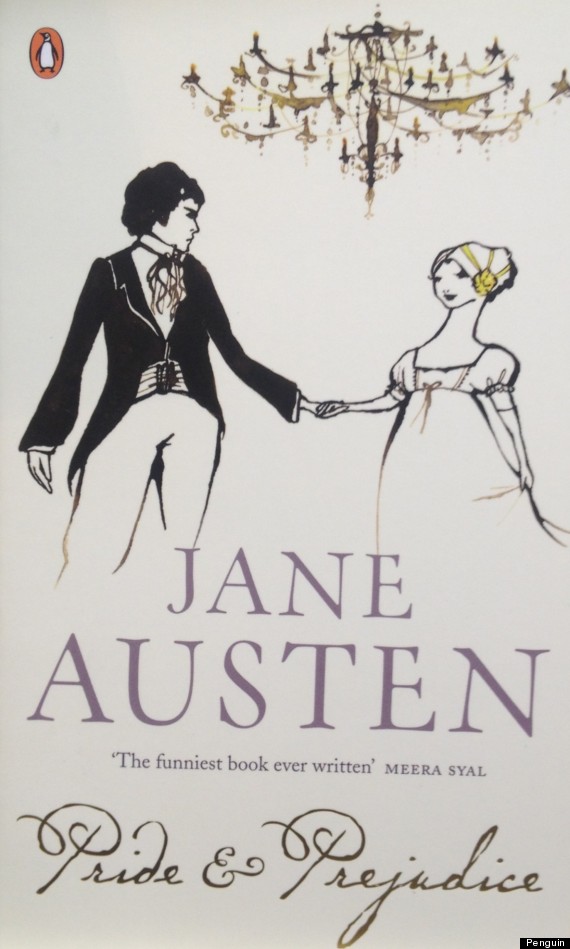
Red Classics
The Austen novels in Penguin's Red Classics line feature lovely, minimalistic line drawings by Kazuko Nomoto, making for mass-market paperback editions that are inexpensive and yet beautiful.
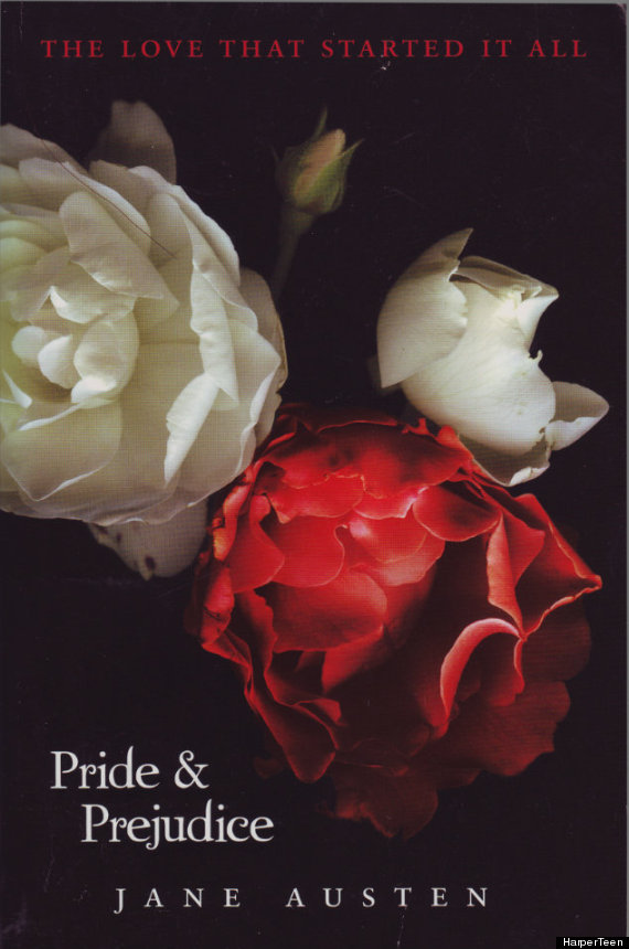
HarperTeen
The audience for this edition from HarperTeen is obvious, as the covers echo the design of Stephenie Meyers' Twilight novels, which is rather unfortunate as Austen's "light, and bright, and sparkling" novel is presented as something dark and Gothic. This seems at least to be untruth in advertising, but perhaps the young persons picking it up will discover that they prefer the light.
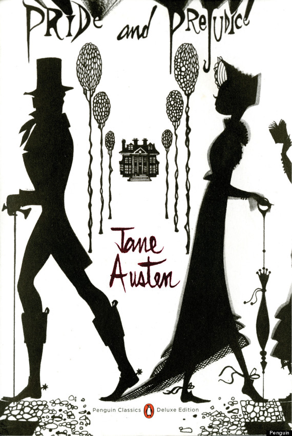
Penguin Classics Deluxe Editions
Fashion illustrator Ruben Toledo drew the cover for this edition from Penguin, with a design that is eye-catching and modern in the best way. The cover drawing, with Elizabeth and Darcy walking away from each other -- while looking back at one another -- is perfectly in tune with the story.
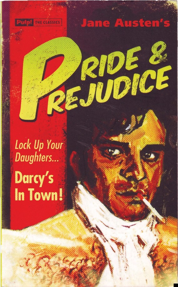
Pulp! The Classics
I can't think of a better way to finish off this collection of Pride and Prejudice over the years with this hilarious cover from Pulp! The Classics. It has fooled a few people into thinking that it was a real pulp-era cover, declaring, "Lock Up Your Daughters... Darcy's In Town!", but the alert reader will note that the painting is rather obviously inspired by Colin Firth, star of the 1995 BBC adaptation of the novel.
Covers of Jane Austen's novels, whether ridiculous or sublime, inevitably change with the times, as do the ways that fans and adapters reinterpret the novels. These are universal stories, rich with material that captures the imagination, so it's easy to see why these reinterpretations happen. Fortunately Pride and Prejudice, as well as Austen's other novels, can withstand a bit of noodling around. The original will always be there between even the most ridiculous covers, ready for a new generation to discover and love.
Margaret C. Sullivan is the author of Jane Austen Cover to Cover: 200 Years of Classic Covers (Quirk).
No comments:
Post a Comment